Whether you are using org chart software such as SmartDraw or some other tool, here are 10 tips to help you build the perfect diagram for your needs.
1. Format the chart to fit on a single page
Use a combination of a horizontal arrangement of boxes at the top of the chart, and vertical below to fit as man
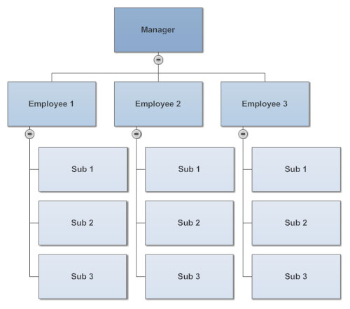
y boxes on a single page as possible.
A combination of horizontal and vertical arrangement of boxes fits more boxes on a page.
Using only horizontal arrangements of boxes makes the chart wider.
2. Group people with the same title into one box
Putting all of the people with the same title into one box saves a considerable amount of space compared with assigning each person their own
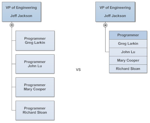
box.
3. Make all boxes the same size and space them evenly
Charts look much better if all of the boxes are the same size (except for multi-person boxes) and the spaces between boxes are the same.
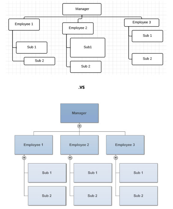
Choose organizational chart software that does this automatically.
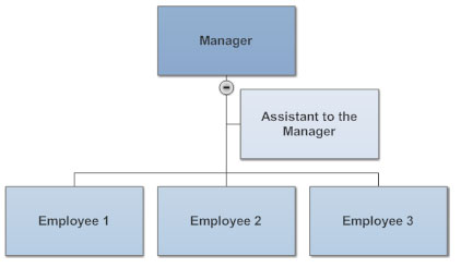
4. Show assistants with a side bar below the manager
Assistants should be shown with a box that comes off the line that connects the manager to his or her subordinates. This distinguishes the role of the assistant from other people that report to the manager.
5. Put the title of the position first, then the name of
the person occupying it
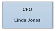
The title of the position (the job title) should be shown above the name of the person occupying it because positions define the organizational structure, not the people who currently occupy them. You can change people's
You can also hyperlink boxes in the chart to other electronic documents, such as the job description of the position without changing the structural arrangement of the chart.
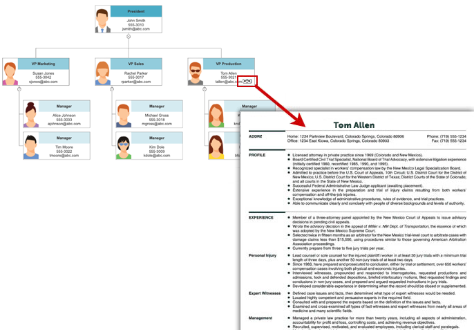
.
6. Show managers with two titles as two different boxes in the chart
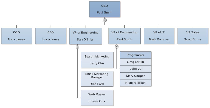
Particularly in smaller companies, one person may manage multiple parts of the organization. For example in this technology company, the CEO, Paul Smith, also acts as the VP of Engineering. Both the management team and the programmers report to him. The best way to show this is to include both positions in the chart and show Paul as occupying both of them. Remember, the organizational structure is based on positions; not the people that occupy them.
7. Use dotted lines sparingly
Sometimes it can be helpful to show relationships with a dotted line connecting the boxes of two positions. One common example is an assistant that works for three managers.
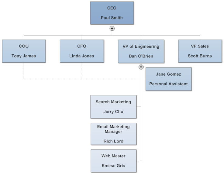
Jane is connected to Toby and Linda by dotted lines because she assists them, as well as Dan. She reports directly to Dan, as shown by the solid line. It's not useful to try and impose the structure of multiple teams on the organization chart with lots of dotted lines. Too many and the chart becomes a mess. To show teams, it's better to use separate charts such as this one.
Sometimes it can be helpful to show relationships with a dotted line connecting the boxes of two positions. One common example is an assistant that works for three managers.

Jane is connected to Toby and Linda by dotted lines because she assists them, as well as Dan. She reports directly to Dan, as shown by the solid line. It's not useful to try and impose the structure of multiple teams on the organization chart with lots of dotted lines. Too many and the chart becomes a mess. To show teams, it's better to use separate charts such as this one.
8. Draw your chart automatically by importing employee data
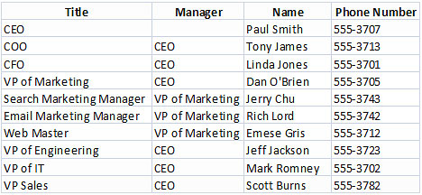
The best organizational chart software programs will create your chart automatically. This is accomplished by importing a data file that lists the title of each position, the name of the person assigned to it and the title of their manager in each row. You can create one of these in a spreadsheet program, such as Excel®:
You can use any application, not just Excel, to create a file formatted this way, including PeopleSoft® or SAP R/3®.

9. Create an online version of your chart with hyperlinks to more information
Most people are familiar with printing an organizational chart on paper, but distributing them online can be much more useful. Both let you see the structure of an organization and read the names and titles of the people that work in it, but only an online chart lets you interact with it.
If you want to know who the VP of Sales' assistant is, you can find out from the org chart. With a printed chart if you want to contact her, you can find her name, but then have to look up her email address. With an online chart, her name can be linked directly to her email address, so that clicking on it in initiates an email to her automatically. Positions can also be hyperlinked to other documents, like job descriptions, or even records in the employee database. Your org chart can become a visual interface to more detailed information.
10. Break up large charts in to multiple smaller linked charts
In any format, a very large chart is cumbersome to view. An org chart showing every employee of a large company like GE is impossibly too big and complex to be useful. A more manageable approach is to break the organization up into smaller groups, each with a reasonably-sized org chart, and then link them together. For example, here is GE's top-level organization chart:
Each of the presidents heads up a different company within GE. Their positions can be linked to the org chart for that company. For example, the box for Healthcare links to the org chart for GE Healthcare:
The healthcare chart itself is so large each of these positions links to charts for the CIO's organization, the Business Development organization, and so on. Each sub-chart links back to its parent, so no matter where a reader is in the hierarchy, they can find their way back to the top.
- ۹۸/۰۴/۱۶

